Bruta — Brand Book
Visual identity project for Bruta, a student agency created at FAPCOM with the mission of transcending stereotypes and celebrating authentic Brazilian diversity — bridging brands and real personal stories through creative excellence and cultural sensitivity.
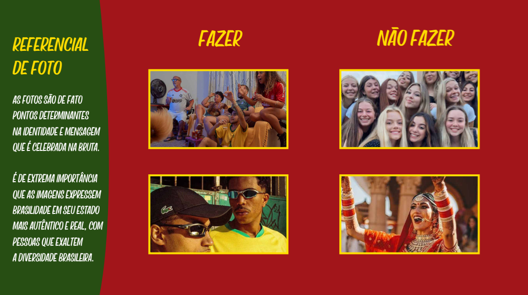
The brand book compiles all elements of the agency’s visual kit: visual approach, typographic system with font hierarchy, a flexible and harmonious color palette, logo usage guidelines, crop references, and photo references — establishing how Bruta should consistently present itself to the world.
Challenges
Translating the agency’s founding values — transparency, diversity, equity, relationships, and freedom — into a visual system that is both disruptive and functional, capable of ensuring brand consistency across different applications without losing the energy and identity that make Bruta recognizable.
Results
A complete and actionable visual identity guide that defines not only what Bruta looks like, but how it should express itself — with emphasis on the representation of real people, authentic Brazilian identity, and creative disruption as a market positioning.